Call for a quote: 07989713648, or pop into the shop!

Responsive web design and development

Google mobile friendly /

What is it, and why you should adopt or upgrade to responsive design for your website

Why responsive

Back in April 2015 Google rolled out its latest search update, which essentially favored mobile friendly websites in the search results when made from a mobile or tablet device over websites that did not meet the criteria.

Is your site mobile friendly, you can check your website on google page here.

The intention of the new update is to help standardise the internet and improve the users experience streamlining a website so that it looks great and is fully functional across all browsing media.

In the past web developers would often build a separate site to accommodate the smaller devices people use to browse the internet, but with the adoption of responsive design there is no longer a need for two sites. A well developed responsive website will adapt it's dimensions and text size/spacing etc, to accommodate all possible devices.

Responsive development

At OneUp Web design we have been building responsive sites since the update was announced and found that many of our clients have become aware of the changes imposed by google, and ask if it is a service we offer.

Responsive Design

All our new sites are build now with responsiveness in mind using 'bootstrap as the core scaffolding for the websites structure.

How this page adapts when viewed on a mobile device

Mobile search engine optimisation

If you rely on traffic coming to your website to drive sales for your business, it would be in your best interest to have a mobile friendly website. With more users than ever accessing the internet via mobile and tablet devices, you may find yourself loosing google ranking places and subsequent business.

Beautiful websites

A website needs to immediately grab your attention. The user needs to find exactly what they are looking for within the first few seconds.

Sensible clean design, easy to use navigation, consistency across pages and across browsing applications.
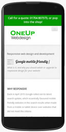
Responsive layout

With so many devices used to access the web, form mobile phones to tablets, laptops and PC's and many smart TV's now have a browser. Older style sites struggle to be read on smaller devices, often bursting out the view port or conversely too small and fiddly to be used. Responsive design adapts to whatever device you are using, and resizes to accommodate the particular viewport. Shrink your browser window or check this page on a different device to see the magic in action

Social media marketing

Get your website noticed. Twitter, Google plus, Pinterest, are all great resourses for getting the word out about your product or service. The problem is other than liking your friends posts on facebook many of us just don't have the time to dedicate to a marketing campaign.

Contract us to manage your marketing as part of a dedicated SEO strategy

Search engine optimisation

So what is Search engine optimisation?

Many many things that all coming together, the underlined text above is a subtle example of inpage optimisation at work. Google recognices that I have given that particular phrase a little more importance than the surrounding text, and consequently google will assign more weight to it. When combined with other factors and a good structured build a page, or site generally does better for it's given content.

Drop us a line to talk about your project